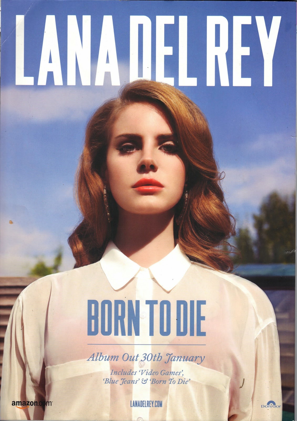
 The style of the digipak advert is one of a gritty vintage like effect which people would class as indie. This effect can be conventional within the indie pop genre moreover making it appealing to the audience. The image used gives off a summer like vibe due to being taken outdoors alongside the use of blue and white colour scheme which is commonly linked with the season of summer. The colour of the font "Lana Del Rey"is in white which is the same colour as her shirt and the title track "Born to Die" is in blue which is of a similar shade to the sky. This gives the advert a clean cut image presenting it as visually appealing. In general, the design of the advert oozes simplicity this allows you to really focus on the artist and the important information listed, this makes it easier to catch the target audiences attention.
The digipak advert is appealing to the target audience is the fact that the artist covers majority of the page once again emphasises her importance and how all attention should be focused on her. By the use of placing the artist in the middle of the page creates powerful interpretation which you receive from the direct eye contact and the camera angle, meaning the target audience would look up to her for inspiration. Also, this advert shows a feel of voyeurism due to her being represented as attractive. This is highlighted through her flawless features and conventionally resulted in younger audiences idolising her.
Her costume and makeup is very minimal consisting of a white top and natural looking makeup, this is more standard to the indie side of her as she doesn't have a dramatic outfit or makeup which is typically seen in the pop genre for females. The shot hardly shows the background as she is positioned in the middle of the shot, such an image makes her look intimidating and powerful due to it being angles slightly low as if she is looking down at the audience whilst making direct eye contact with the camera.
No comments:
Post a Comment