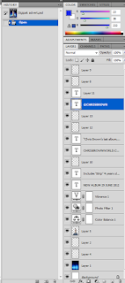
 The magic wand tool was used in order to deselect unwanted areas of the font. The magic wand tool also enabled us to get rid of whilst it remained neat and clear to not cut any other areas out. We used a font that was already installed for the rest of the text on page such as review, album release date and artist website, this saved us more time as we could easily type into the text box and then choose our font rather than constantly switching back and forth to the 'magic wand tool' and 'quick selection tool' We made a new layer for each edit so that we could delete anything if we happened to changed our minds. We also included other conventional advert features such record label logo, social networking site and where the album can be bought, this was done by finding each feature on 'Google images' and pasting it onto Photoshop.
Additionally, we also found the background on 'Google'. Lastly our main image used in the advert was created by using the 'lasso tool', this feature was used cut around the original image only leaving the mid shot of the male lead, then used the eraser tool to make the image neater.
No comments:
Post a Comment