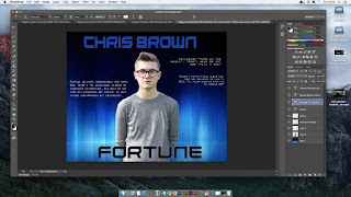
To create/produce our digipak we used the software application 'Photoshop' in order to create each element that made up the digipak as a whole. The first image shows the front cover as with the digipak advert we also used '1001fonts.com' to type the album name and artist name, this was then pasted onto Photoshop to place in our designated area of the cover, we also used the magic wand tool in order to cut around the image so we were only left with the profile of our male character this was done along with the eraser and lasso tool, similar steps were taken for the digipak back cover.

The second image shows the back cover of our digipak, we retrieved the dark blue background from 'Google images'. Additionally we also included features such as the record label logo and bar code to make it seem more professional and of a high standard. Both features were taken from Google images we just pasted it into Photoshop and used the quick selection tool in order to cut out the unwanted areas. The text we used for the back cover was originally taken from Photoshop we used a white bold typography for the track list of the album. Once again we used the magic wand tool to create the main image of the main character, the tool removed the original background replacing it with our chosen dark blue background and lastly the photo was taken using a DSLR digital camera.
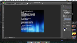
This next image shows the inside pocket of the digipak, once again we used another black and blue background which was also found on 'Google', moreover we used Photoshop's typography to write the name of the songs followed by a quote briefly describing the song itself.
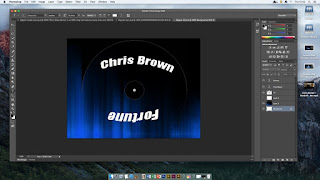
The last image is of the main CD of the digipak once again retrieving a background from 'Google', the CD template also came from Google, we then used the magic wand tool to cut out the CD template and make it blank. After we overlayed the blank template to the background, then we chose a font from Photoshop to type the artist name and album title, after we used the arc tool in order to stretch out and allow the font to curve around the inner circle of the CD cover making it look more professional and visually pleasing.
 To create/produce our digipak we used the software application 'Photoshop' in order to create each element that made up the digipak as a whole. The first image shows the front cover as with the digipak advert we also used '1001fonts.com' to type the album name and artist name, this was then pasted onto Photoshop to place in our designated area of the cover, we also used the magic wand tool in order to cut around the image so we were only left with the profile of our male character this was done along with the eraser and lasso tool, similar steps were taken for the digipak back cover.
 This next image shows the inside pocket of the digipak, once again we used another black and blue background which was also found on 'Google', moreover we used Photoshop's typography to write the name of the songs followed by a quote briefly describing the song itself.
 The last image is of the main CD of the digipak once again retrieving a background from 'Google', the CD template also came from Google, we then used the magic wand tool to cut out the CD template and make it blank. After we overlayed the blank template to the background, then we chose a font from Photoshop to type the artist name and album title, after we used the arc tool in order to stretch out and allow the font to curve around the inner circle of the CD cover making it look more professional and visually pleasing.
No comments:
Post a Comment