Friday, 21 April 2017

Thursday, 20 April 2017

Mise en scene
Lighting - For the flashback scene the lighting used was luminous in order to reflect the pleasant memories of a past relationship. The establishing shot at the train tracks consisted of bright, shining light this was used in order to set the scene reflecting feelings of happiness at the time. The use of shimmering lighting makes the audience feel at ease and content with the peaceful setting as the instrumental begins to play in the background. Our music video narrative consists of a relationship that is soon to end mainly filled with flashbacks of the past where the relationship was positive this is once again mirrored through the use of dazzling light. Chris Brown's 'Don't Judge Me' is a R&B/Ballad song with a slow tempo which once again reflects the lighting used.
Location - We chose to film outdoors as its fits with most scenes that we took which gave off a pleasant vibe. As the genre is an R&B/Ballad song we felt it was relevant to create a narrative that reflected the lyrics of the song, overall, we believed it was more fitting to film outdoors. Most of the scenes outdoors were narrative based of the male lead walking alone in a deserted field this emphasised the lyrics of the song "I don't want to go there" this creates a feeling of loneliness, which reflects the breakdown of a relationship, this can appeal to the audience as it's relatable and realistic for those that have been through a breakup. For the flashback scenes we decided to film at a busy location such as a shopping centre the scene shows the couple having fun shopping together.
The colours used throughout the music video varies as the establishing shot/ intro reflects a bright, sunny day but then as the scenes begin to develop the colour changes to a more artificial style of lighting as the scenes were taken indoors.
Location - We chose to film outdoors as its fits with most scenes that we took which gave off a pleasant vibe. As the genre is an R&B/Ballad song we felt it was relevant to create a narrative that reflected the lyrics of the song, overall, we believed it was more fitting to film outdoors. Most of the scenes outdoors were narrative based of the male lead walking alone in a deserted field this emphasised the lyrics of the song "I don't want to go there" this creates a feeling of loneliness, which reflects the breakdown of a relationship, this can appeal to the audience as it's relatable and realistic for those that have been through a breakup. For the flashback scenes we decided to film at a busy location such as a shopping centre the scene shows the couple having fun shopping together.
The colours used throughout the music video varies as the establishing shot/ intro reflects a bright, sunny day but then as the scenes begin to develop the colour changes to a more artificial style of lighting as the scenes were taken indoors.
Wednesday, 19 April 2017
Digipak advert analysis
The digipak advert for Lana Del Rey's 'Born to Die' is created in such a way that it promotes the artist highly effectively,The layout of this digipak advert conforms the conventional features through multiple ways; the artists name is presented in large, bold eye catching typography at the very top of the advert, this is followed by the image of the artist of which is placed centre of the page, this is conventional as it's promoting the artist. This advert also promotes the album title along with the three album hits. There is also an official website located at the bottom of the page, this is typical of a advert as it promotes herself and gives you the opportunity to look at her site, whilst learning more about her crafts as an artist. There is also a link to amazon.com which would be a direct link to her album, this feature encourages you to buy her album. One feature that isn't presented on this digipak advert is the critical acclaims, usually adverts include some form of review or star rating which tend to come from newspapers or magazines.
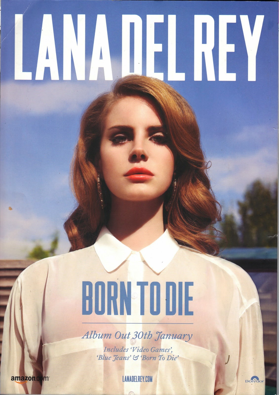 The style of the digipak advert is one of a gritty vintage like effect which people would class as indie. This effect can be conventional within the indie pop genre moreover making it appealing to the audience. The image used gives off a summer like vibe due to being taken outdoors alongside the use of blue and white colour scheme which is commonly linked with the season of summer. The colour of the font "Lana Del Rey"is in white which is the same colour as her shirt and the title track "Born to Die" is in blue which is of a similar shade to the sky. This gives the advert a clean cut image presenting it as visually appealing. In general, the design of the advert oozes simplicity this allows you to really focus on the artist and the important information listed, this makes it easier to catch the target audiences attention.
The digipak advert is appealing to the target audience is the fact that the artist covers majority of the page once again emphasises her importance and how all attention should be focused on her. By the use of placing the artist in the middle of the page creates powerful interpretation which you receive from the direct eye contact and the camera angle, meaning the target audience would look up to her for inspiration. Also, this advert shows a feel of voyeurism due to her being represented as attractive. This is highlighted through her flawless features and conventionally resulted in younger audiences idolising her.
Her costume and makeup is very minimal consisting of a white top and natural looking makeup, this is more standard to the indie side of her as she doesn't have a dramatic outfit or makeup which is typically seen in the pop genre for females. The shot hardly shows the background as she is positioned in the middle of the shot, such an image makes her look intimidating and powerful due to it being angles slightly low as if she is looking down at the audience whilst making direct eye contact with the camera.
The style of the digipak advert is one of a gritty vintage like effect which people would class as indie. This effect can be conventional within the indie pop genre moreover making it appealing to the audience. The image used gives off a summer like vibe due to being taken outdoors alongside the use of blue and white colour scheme which is commonly linked with the season of summer. The colour of the font "Lana Del Rey"is in white which is the same colour as her shirt and the title track "Born to Die" is in blue which is of a similar shade to the sky. This gives the advert a clean cut image presenting it as visually appealing. In general, the design of the advert oozes simplicity this allows you to really focus on the artist and the important information listed, this makes it easier to catch the target audiences attention.The digipak advert is appealing to the target audience is the fact that the artist covers majority of the page once again emphasises her importance and how all attention should be focused on her. By the use of placing the artist in the middle of the page creates powerful interpretation which you receive from the direct eye contact and the camera angle, meaning the target audience would look up to her for inspiration. Also, this advert shows a feel of voyeurism due to her being represented as attractive. This is highlighted through her flawless features and conventionally resulted in younger audiences idolising her.
Her costume and makeup is very minimal consisting of a white top and natural looking makeup, this is more standard to the indie side of her as she doesn't have a dramatic outfit or makeup which is typically seen in the pop genre for females. The shot hardly shows the background as she is positioned in the middle of the shot, such an image makes her look intimidating and powerful due to it being angles slightly low as if she is looking down at the audience whilst making direct eye contact with the camera.
Digipak analysis
Justin Bieber's 'Believe' album was the third studio album released 15th June 2012. Bieber is a pop artist with a huge female following/target audience. Believe was the sixth global best-selling album of 2012 with a tremendous three million sales.
 Whilst analysing the digipak I began to notice that his profile and face played a prominent role on the front cover, most likely due to attract, appeal to and please his female fans with his good looks. In this digipak Bieber is seen in a mid shot, looking away from the camera, this could display the lack of direct address and interaction between him and the audience, therefore portraying him as a distant figure.
The font type used in the digipak oozes simplicity, mainly due to the importance of the album cover relying more on the actual image of the artist rather than font style itself. The font type used for the album title 'Believe' is the largest font on the digipak highlighting it's importance which is emphasised by a bold colour, by having the word 'Believe' in a large font brings it added attention, moreover, by doing so, the positive message that this album aims to spread to it's chosen target audience is being achieved.
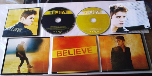 In addition to the mid shot of Bieber on the front cover, there are various other images included, further adding to its portrayal. On the back cover he is seen busking with a guitar that says 'Believe', this is an example of anaphora, a reference to his past as he rose to fame by busking and posting videos of himself singing acoustically. By having the name of his album on the guitar case, it highlights the positive message he's trying to spread, by believing in yourself you can achieve anything.
 On the inside of the digipak, Bieber is seen in two long shots and one mid shot, in particular he is seen dancing behind a moonlight, this could be seen as an inter textual reference to Michael Jackson who's a huge inspiration to Bieber, this is further supported by the low key lighting and dark settings in the background. In all these images Bieber never addresses the camera further displaying his portrayal as an icon rather than a teen sensation.
The digipak opens up and inside the middle panel we're greeted with a ton of pictures from the album photo shoot, this feature emphasises the importance of his fans once again by appealing to them with exclusive photos, the digipak also comes with a poster which the fans can put up on their bedroom wall, this shows that there is a more personal connection between the artist and the fans.

 Whilst analysing the digipak I began to notice that his profile and face played a prominent role on the front cover, most likely due to attract, appeal to and please his female fans with his good looks. In this digipak Bieber is seen in a mid shot, looking away from the camera, this could display the lack of direct address and interaction between him and the audience, therefore portraying him as a distant figure.
The font type used in the digipak oozes simplicity, mainly due to the importance of the album cover relying more on the actual image of the artist rather than font style itself. The font type used for the album title 'Believe' is the largest font on the digipak highlighting it's importance which is emphasised by a bold colour, by having the word 'Believe' in a large font brings it added attention, moreover, by doing so, the positive message that this album aims to spread to it's chosen target audience is being achieved.
In addition to the mid shot of Bieber on the front cover, there are various other images included, further adding to its portrayal. On the back cover he is seen busking with a guitar that says 'Believe', this is an example of anaphora, a reference to his past as he rose to fame by busking and posting videos of himself singing acoustically. By having the name of his album on the guitar case, it highlights the positive message he's trying to spread, by believing in yourself you can achieve anything.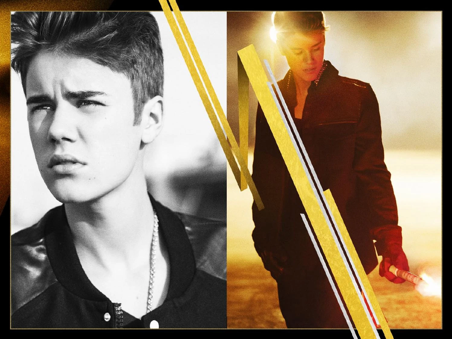 On the inside of the digipak, Bieber is seen in two long shots and one mid shot, in particular he is seen dancing behind a moonlight, this could be seen as an inter textual reference to Michael Jackson who's a huge inspiration to Bieber, this is further supported by the low key lighting and dark settings in the background. In all these images Bieber never addresses the camera further displaying his portrayal as an icon rather than a teen sensation.
The digipak opens up and inside the middle panel we're greeted with a ton of pictures from the album photo shoot, this feature emphasises the importance of his fans once again by appealing to them with exclusive photos, the digipak also comes with a poster which the fans can put up on their bedroom wall, this shows that there is a more personal connection between the artist and the fans.
Tuesday, 18 April 2017
Audience
For our music video we decided to target teenagers, typically between the ages 15-24 that are fans of Chris Brown or generally enjoy his style of music. We want our target audience to react positively to our music video production as the video was created for others that have experienced relationships and breakups to relate to our content highlighting a sense of realism. The genre of our chosen song of Don't Judge Me by Chris Brown is R&B/Ballad therefore reflecting powerful emotions hence the reason why we chose a narrative based song in order to tell a story through the lyrics.
Subscribe to:
Posts (Atom)