How did you use media technologies in the construction and research, planning and evaluation stages?
In order to create the best possible outcome for my final product I used various media technologies throughout the different stages of research, planning and evaluation to the construction of my music video followed by digipak and digipak advert. The use of media technologies were fairly easy to utilise, they allowed me to assess media texts as well as developing my editing skills on software applications such as 'Final Cut Pro' and was able to further develop my knowledge on Photoshop.
Blogger played a key role in the construction of my A2 task. Using Blogger allowed me frequently record my research and own work. in a clear and professional presentation/layout. By using Blogger I was able to gain/develop my IT and presentational skills in order for my blog to look appeal to others whilst also vigorously learning to use the website as I developed my work.
Blogger gave me the chance to change my blog layout/colour scheme this allowed my personality to show through my work whilst also allowing me to present my work in various forms. I chose this layout in particular as I felt that it look appealing and bubbly hence the bold/bright colours used. Blogger was continuously used throughout the production of my work including planning, production and evaluation process, Blogger was used they whole way through the process of making my work as there is no limit to how many posts to upload.
Alongside Blogger, Prezi also helped me tremendously through the continuation of my work onto evaluation, using prezi allowed me to express my creativity through their different forms of layouts which allows you to turn your work into a moving and interactive presentation. You're also given the opportunity to select different template from various styles and themes this encouraged the establishment of my work, to elaborate it allows you to create a pathway which emphasises the journey you went on with your work, having already used this website before I was easily able to work on it without any problems.
Most of our research and planning took place on Google and YouTube, researching other R&B music videos and looking into the artist Chris Brown on Google. Such websites allowed us to directly us to previous work related to R&B genre such as current digipaks which gave us a clear as to what we hoped for ours to look like, this allowed us to not completely rely on our own thoughts of typical conventional aspects of a R&B music video rather broaden our horizons/views on how of this particular genre. From carrying out such research we found out that a narrative based music video would be the best and most conventional for our target audience, this would be done through colour schemes, narrative and mise en scene. This was shown in our music video and ancillary tasks, all of which would have not been as successful without planning and researching thoroughly beforehand.
For the music video production we knew it was vital to use a advanced and professional editing software which would allow us to not only produce our music video but also allow us to overlay filters over the video. Therefore we decided that 'Final Cut Pro' was an appropriate software application to use, even though at times it became difficult to use we soon got the hang of it from the help of tutorial videos on YouTube. We then imported all of our footage and listened to the song so that we could insert the footage to match the lyrics of the song. We also used a camcorder effect for the 'flashback' scene to make it look as if the 'female character' was recording the happy memories she spent with the male lead, the colour of the scene was filtered in order for it to look like the past. This overall helped us portray a clear and consistent narrative throughout our music video.
Wednesday, 26 April 2017
Tuesday, 25 April 2017
Evaluation 3
What have you learnt from audience feedback?
Before the production of our music video, we carried out a questionnaire asking participants what they believed were typical conventions of R&B music videos and Pop music videos, we also asked what there thoughts were on narrative based music videos that consist of a 'point of view' concept, the response was positive as they thought using a 'point of view' concepts was something new and unique especially with an R&B music video were we typically see party scenes and flashy cars etc... they also believed that a 'point of view' concept would work really well with a narrative based video as audiences would feel as if they're the 'female character' or the camera in the video, this would appeal more to the audience rather than having a female character present in frame with the male. We chose to carry out a questionnaire in order to see if people thought our music video was successful in conveying a narrative based followed by a point of view concept and whether our music video was targeting the correct chosen audience of teenagers aged between 15-24.
The camera shots and techniques were also given a positive response as we kept it simple and used the general conventional camera techniques such as still, close ups, tracking, mid shots and long shots, such techniques were said to make the music video look more realistic and of a professional standard, they also liked the use of strong mise en scene to show that this is a R&B/Ballad music video.
Although we didn't receive much negative feedback rather it was criticism such as using a slow motion effect in the first shot of our male lead as he walks away from the camera whilst the camera follows his back, we were told to change the pace of the scene as it was going to quickly therefore people believed it didn't fit with the pace of the song, so we took on board this criticism in order to change the pace of that shot making it 50% slow motion by using 'final cut pro' the final outcome was great and such advice really helped to make our music video flow well and look of a professional standard.
Monday, 24 April 2017
Evaluation 2
How effective is the combination of your main product and ancillary texts?
In order to identify certain brands, standing out is vital whilst also highlighting visible featured such as colour, design, name and logo such elements suggest are used in order to appeal and attract audiences whilst also allowing them to understand and identify the brand.
Having our own brand identity was vital in producing our music video alongside our ancillary texts, this is mainly due to the fact that the final product is ensured to stand out and carry similar features as to what the target audience expect from such a genre. therefore these features would appeal to audiences as they would be attracted to each component which builds up to produce the final outcome supported by positive audience reaction.
We created a brand identity in our music video and digipaks by using certain elements/features the target audience would associate with our chosen music genre of R&B/Ballad. We felt that having a bold colour scheme would fit, this consisted of a mixture of light blue, dark blue and black, such colours represent the artist as powerful, superior and someone who's also serious in their craft. We also used white bold typography on both our digipak and digipak advert we did this in order to balance out between the variations of colours whilst also creating a contrast between the dark blues and white. This gave the album a pleasant feel. Our chosen fonts were created on the website "1001FONTS.COM". Furthermore the idea of brand identity was later emphasised by using similar looking images throughout the digipak and advert, this was done by taking the images in one frame but in different angles/ camera techniques, a mixture of mid shots, close ups and long shots, images when the main character is looking directly at the camera whilst others of him looking away. This was done in order to create a huge contrast in both styles of the digipak and advert.
The music video itself contained brand identity which was influenced by the narrative concept, this consisted of the journey from the start of a relationship to the end. moreover all three products were able to create a well developed brand identity in order for the audience to engage with it's purpose. The digipak and advert are of importance as they sell the song/album as a whole this is highlighted by the use of visual features in order to portray the genre and also reflect the artist style and craft.
What we did differently between our main production and ancillary texts was the use of transitions within our music video We chose to use 4-5 of the same transitions in order to create a consistent flow and to also keep our video looking realistic. Some of the transitions used included; "Bloom" which was used in the "flashback" scene "Cross Dissolve" which was used in the very beginning/establishing shot of the video and "Directional" which was also used in the "flashback" scene. The use of such transitions added creativity to our music video rather than having abrupt jump cuts the transitions allowed our music video to flow consistently.
Sunday, 23 April 2017
Evaluation 1
In what ways does your media product use. develop or challenge forms and conventions of real media products?
When creating our music video, digipak and digipak advert we had to consider the conventions of real media products in order to produce the best final outcome.
When filming our music video we chose to take it by using a point of view concept, this meant that there was only one main character present in our music video, nonetheless the camera was a representation of the 'female character'. Throughout our main scenes the male lead present in the video would directly make eye contact with the camera as if it was an actual person. Using the idea of a point of view concept challenges forms and conventions of most music videos as the typical narrative based music video would have a female and male lead which is represented by a two shot allowing both characters to be in frame and present. This led us to use an over the shoulder camera shot in order to create point of view. By using such a shot this creates connection between the audience and the male lead making them feel as if they're the 'female character' in the music video.
A typical camera shot convention used was an establishing shot or the opening 30 seconds in which we see train tracks, this follows the guidelines of real media products as in standard music videos having an establishing shot is critical as its used to set the scene within the opening shot which is then reflected by the tone of the song which influences genre. To elaborate if a music video includes a party scene, full of excitement and colour it's most likely of the genre Pop. We also used a range of long shots and mid shots in order to convey general camera conventions in your standard music video, these type of shots were mainly used for our 'flashback' scene which showed the couple in their happier days. Additionally we used still shots followed by a series of tracking shots to show the movements of our main character in an open area which emphasises the feeling of longing for someone. From both techniques I think still shots were of better quality as we were able to capture a certain feel whilst the camera being in focus and stable. Another way in which we challenged conventions of music videos was the use close ups to convey raw emotion between the male lead and the camera which was playing as the female character, we didn't frequently use close ups as it didn't generally fit in with our scenes we felt that the use of mid shots fit with the concept that we tried to portray in our music video which was a point of view concept how the male lead is acting as if the camera is the female character. Also by using mid shots the characters emotions and body language could be conveyed better.
For conventions of mise en scene, we chose to film in two different locations the beginning of the music video was filmed at Millennium Green, which is an open field area, this was suitable for our establishing shot in order to get the subject in frame whilst also emphasising the feeling of loneliness and longing. Our second filming location was at a shopping centre this was for our flashback scene and where the characters part ways at the end of the video. For the editing part of our music video we used conventional features such as cuts and transitions, using such conventions allowed our music video to still follow the direction of a standard music video.
Moreover, for the production of our music video, we followed the conventional style. theme and concept of a R&B/Ballad video by filming in a deserted open area whilst keeping it solely narrative based, as we frequently showed our main character throughout the music video. Furthermore we did challenge the conventions of a typical R&B music video which commonly consist of stereotypical features such as night clubs and party scenes. This is of importance as it showed we could still maintain a narrative concept within the genre of R&B.
The making of our digipak consisted of conventions of typical digipaks as we used dark blues with a slight touch of black throughout our digipak production in order to show consistency and flow. This reflects the mood of our album. Additionally, our digipak/advert included a range of mid shots and close ups that were placed in the centre of the page to emphasise status, power and superiority, showing that they're the star. Such conventions reveal meanings behind lyrics and therefore took this into consideration whilst producing my final product.
Overall, the conventions of real and existing media products are vital to take into considerations as it keeps the digipak/ music video realistic and therefore reliable to the audience whilst also challenging such forms in order to give your product a more unique feel.
Saturday, 22 April 2017
Production of Digipak
 To create/produce our digipak we used the software application 'Photoshop' in order to create each element that made up the digipak as a whole. The first image shows the front cover as with the digipak advert we also used '1001fonts.com' to type the album name and artist name, this was then pasted onto Photoshop to place in our designated area of the cover, we also used the magic wand tool in order to cut around the image so we were only left with the profile of our male character this was done along with the eraser and lasso tool, similar steps were taken for the digipak back cover.
 This next image shows the inside pocket of the digipak, once again we used another black and blue background which was also found on 'Google', moreover we used Photoshop's typography to write the name of the songs followed by a quote briefly describing the song itself.
 The last image is of the main CD of the digipak once again retrieving a background from 'Google', the CD template also came from Google, we then used the magic wand tool to cut out the CD template and make it blank. After we overlayed the blank template to the background, then we chose a font from Photoshop to type the artist name and album title, after we used the arc tool in order to stretch out and allow the font to curve around the inner circle of the CD cover making it look more professional and visually pleasing.
Production of Digipak advert
The production of our digipak advert was created on the software application 'Photoshop'. We then constructed the artist name and album on '1001fonts.com', on this website we chose the font 'United Kingdom' as we felt it worked very well with the concept/style of our overall production and also linked very well with our chosen genre of R&B. We chose the colour scheme which was a mixture between blue, white and black this was shown consistently throughout our advert, the reason for choosing such colours came from the idea of matching with the digipak itself. We chose to use the colour white for the artist name as it stood out against the black/blue background, we also changed the size of the font in order for it to fit completely on the designated areas, enlarging the name meant that everyone will easily be drawn to it as they would know Chris Brown.
 The magic wand tool was used in order to deselect unwanted areas of the font. The magic wand tool also enabled us to get rid of whilst it remained neat and clear to not cut any other areas out. We used a font that was already installed for the rest of the text on page such as review, album release date and artist website, this saved us more time as we could easily type into the text box and then choose our font rather than constantly switching back and forth to the 'magic wand tool' and 'quick selection tool' We made a new layer for each edit so that we could delete anything if we happened to changed our minds. We also included other conventional advert features such record label logo, social networking site and where the album can be bought, this was done by finding each feature on 'Google images' and pasting it onto Photoshop.
Additionally, we also found the background on 'Google'. Lastly our main image used in the advert was created by using the 'lasso tool', this feature was used cut around the original image only leaving the mid shot of the male lead, then used the eraser tool to make the image neater.
Friday, 21 April 2017
Production of music video
Our music video production started by choosing the genre of R&B/Ballad which was then followed by using a narrative based concept, which was based on the journey of a relationship until the breakup this was done by using flashbacks to showcase the happy memories, then the ending seen shows the breakdown of a relationship when it's over this is emphasised by the use of slow motion to highlight the emotions/feelings portrayed in such a scene. We also created our music video in the style of point of view(POV). The reason for this choice is because it's more realistic and relatable for the audience allowing them to understand the narrative as they could have also been in a relationship followed by a breakup. Additionally it reflects the 'artist' conveying emotion. We decided to portray the camera as the 'female character' rather than having a female in frame with the male lead, this allowed the audience to engage more with our music video as the male lead is frequently seen making direct eye contact with the camera.
To edit our music video we used the software application 'Final Cut Pro'. To open up the video we included the name of the artist followed by the song this was done by using the "text" feature. We used the "drifting" feature on the text in order to drift straight out and then be greeted by the establishing shot, this is a still shot at the train tracks that lasts for 30 seconds or less. This is then followed by the transition "cross dissolve" in order to show that we're moving to the next scene. Transitions were used frequently in order to swiftly cut into the next scene so that it makes sense without switching too abruptly and quickly which would confuse the audience and make the video seem messy.
We then overlayed a slow motion effect at 50% onto the the next scene were the male lead is seen walking as the camera follows his back this was used to make the pace match the song, this is shown straight after the use of a 'directional' effect where we change scenes to the male lead sitting down whilst on his phone this then links to the lyrics playing "you're hearing rumours about me..." Then we included another transitions to switch locations from a open area to a shopping centre.
 In order to create the flashback scene we overlayed a camcorder effect in order for it to seem as if the "female" character is recording the male lead, we did this by searching for "overlay camcorder effect" on YouTube after having found a suitable one we then used the screenshot effect followed by the "snipping tool" effect to get rid of any unwanted features after we placed the image onto Photoshop fill the empty space black to match the background, after saving the photo it was then imported into Final Cut Pro in order to to be placed over the flashback scenes. Furthermore we used a "Sepia" filter in order for the flashback scenes contain the feel of the past and memories rather than a typical "black and white" effect. Finally, we used a slow motion effect once again to show the couple departing which concludes their relationship and overall the music video.
To edit our music video we used the software application 'Final Cut Pro'. To open up the video we included the name of the artist followed by the song this was done by using the "text" feature. We used the "drifting" feature on the text in order to drift straight out and then be greeted by the establishing shot, this is a still shot at the train tracks that lasts for 30 seconds or less. This is then followed by the transition "cross dissolve" in order to show that we're moving to the next scene. Transitions were used frequently in order to swiftly cut into the next scene so that it makes sense without switching too abruptly and quickly which would confuse the audience and make the video seem messy.
We then overlayed a slow motion effect at 50% onto the the next scene were the male lead is seen walking as the camera follows his back this was used to make the pace match the song, this is shown straight after the use of a 'directional' effect where we change scenes to the male lead sitting down whilst on his phone this then links to the lyrics playing "you're hearing rumours about me..." Then we included another transitions to switch locations from a open area to a shopping centre.

Thursday, 20 April 2017

Mise en scene
Lighting - For the flashback scene the lighting used was luminous in order to reflect the pleasant memories of a past relationship. The establishing shot at the train tracks consisted of bright, shining light this was used in order to set the scene reflecting feelings of happiness at the time. The use of shimmering lighting makes the audience feel at ease and content with the peaceful setting as the instrumental begins to play in the background. Our music video narrative consists of a relationship that is soon to end mainly filled with flashbacks of the past where the relationship was positive this is once again mirrored through the use of dazzling light. Chris Brown's 'Don't Judge Me' is a R&B/Ballad song with a slow tempo which once again reflects the lighting used.
Location - We chose to film outdoors as its fits with most scenes that we took which gave off a pleasant vibe. As the genre is an R&B/Ballad song we felt it was relevant to create a narrative that reflected the lyrics of the song, overall, we believed it was more fitting to film outdoors. Most of the scenes outdoors were narrative based of the male lead walking alone in a deserted field this emphasised the lyrics of the song "I don't want to go there" this creates a feeling of loneliness, which reflects the breakdown of a relationship, this can appeal to the audience as it's relatable and realistic for those that have been through a breakup. For the flashback scenes we decided to film at a busy location such as a shopping centre the scene shows the couple having fun shopping together.
The colours used throughout the music video varies as the establishing shot/ intro reflects a bright, sunny day but then as the scenes begin to develop the colour changes to a more artificial style of lighting as the scenes were taken indoors.
Wednesday, 19 April 2017
Digipak advert analysis
The digipak advert for Lana Del Rey's 'Born to Die' is created in such a way that it promotes the artist highly effectively,The layout of this digipak advert conforms the conventional features through multiple ways; the artists name is presented in large, bold eye catching typography at the very top of the advert, this is followed by the image of the artist of which is placed centre of the page, this is conventional as it's promoting the artist. This advert also promotes the album title along with the three album hits. There is also an official website located at the bottom of the page, this is typical of a advert as it promotes herself and gives you the opportunity to look at her site, whilst learning more about her crafts as an artist. There is also a link to amazon.com which would be a direct link to her album, this feature encourages you to buy her album. One feature that isn't presented on this digipak advert is the critical acclaims, usually adverts include some form of review or star rating which tend to come from newspapers or magazines.
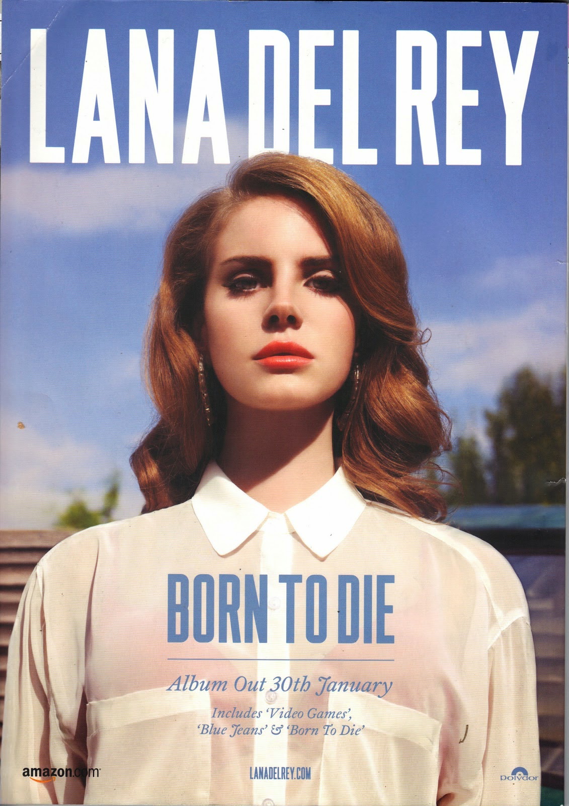 The style of the digipak advert is one of a gritty vintage like effect which people would class as indie. This effect can be conventional within the indie pop genre moreover making it appealing to the audience. The image used gives off a summer like vibe due to being taken outdoors alongside the use of blue and white colour scheme which is commonly linked with the season of summer. The colour of the font "Lana Del Rey"is in white which is the same colour as her shirt and the title track "Born to Die" is in blue which is of a similar shade to the sky. This gives the advert a clean cut image presenting it as visually appealing. In general, the design of the advert oozes simplicity this allows you to really focus on the artist and the important information listed, this makes it easier to catch the target audiences attention.
The digipak advert is appealing to the target audience is the fact that the artist covers majority of the page once again emphasises her importance and how all attention should be focused on her. By the use of placing the artist in the middle of the page creates powerful interpretation which you receive from the direct eye contact and the camera angle, meaning the target audience would look up to her for inspiration. Also, this advert shows a feel of voyeurism due to her being represented as attractive. This is highlighted through her flawless features and conventionally resulted in younger audiences idolising her.
Her costume and makeup is very minimal consisting of a white top and natural looking makeup, this is more standard to the indie side of her as she doesn't have a dramatic outfit or makeup which is typically seen in the pop genre for females. The shot hardly shows the background as she is positioned in the middle of the shot, such an image makes her look intimidating and powerful due to it being angles slightly low as if she is looking down at the audience whilst making direct eye contact with the camera.
The style of the digipak advert is one of a gritty vintage like effect which people would class as indie. This effect can be conventional within the indie pop genre moreover making it appealing to the audience. The image used gives off a summer like vibe due to being taken outdoors alongside the use of blue and white colour scheme which is commonly linked with the season of summer. The colour of the font "Lana Del Rey"is in white which is the same colour as her shirt and the title track "Born to Die" is in blue which is of a similar shade to the sky. This gives the advert a clean cut image presenting it as visually appealing. In general, the design of the advert oozes simplicity this allows you to really focus on the artist and the important information listed, this makes it easier to catch the target audiences attention.The digipak advert is appealing to the target audience is the fact that the artist covers majority of the page once again emphasises her importance and how all attention should be focused on her. By the use of placing the artist in the middle of the page creates powerful interpretation which you receive from the direct eye contact and the camera angle, meaning the target audience would look up to her for inspiration. Also, this advert shows a feel of voyeurism due to her being represented as attractive. This is highlighted through her flawless features and conventionally resulted in younger audiences idolising her.
Her costume and makeup is very minimal consisting of a white top and natural looking makeup, this is more standard to the indie side of her as she doesn't have a dramatic outfit or makeup which is typically seen in the pop genre for females. The shot hardly shows the background as she is positioned in the middle of the shot, such an image makes her look intimidating and powerful due to it being angles slightly low as if she is looking down at the audience whilst making direct eye contact with the camera.
Digipak analysis
Justin Bieber's 'Believe' album was the third studio album released 15th June 2012. Bieber is a pop artist with a huge female following/target audience. Believe was the sixth global best-selling album of 2012 with a tremendous three million sales.
 Whilst analysing the digipak I began to notice that his profile and face played a prominent role on the front cover, most likely due to attract, appeal to and please his female fans with his good looks. In this digipak Bieber is seen in a mid shot, looking away from the camera, this could display the lack of direct address and interaction between him and the audience, therefore portraying him as a distant figure.
The font type used in the digipak oozes simplicity, mainly due to the importance of the album cover relying more on the actual image of the artist rather than font style itself. The font type used for the album title 'Believe' is the largest font on the digipak highlighting it's importance which is emphasised by a bold colour, by having the word 'Believe' in a large font brings it added attention, moreover, by doing so, the positive message that this album aims to spread to it's chosen target audience is being achieved.
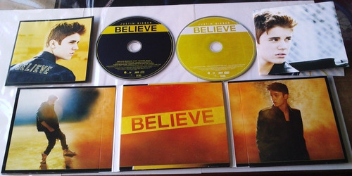 In addition to the mid shot of Bieber on the front cover, there are various other images included, further adding to its portrayal. On the back cover he is seen busking with a guitar that says 'Believe', this is an example of anaphora, a reference to his past as he rose to fame by busking and posting videos of himself singing acoustically. By having the name of his album on the guitar case, it highlights the positive message he's trying to spread, by believing in yourself you can achieve anything.
 On the inside of the digipak, Bieber is seen in two long shots and one mid shot, in particular he is seen dancing behind a moonlight, this could be seen as an inter textual reference to Michael Jackson who's a huge inspiration to Bieber, this is further supported by the low key lighting and dark settings in the background. In all these images Bieber never addresses the camera further displaying his portrayal as an icon rather than a teen sensation.
The digipak opens up and inside the middle panel we're greeted with a ton of pictures from the album photo shoot, this feature emphasises the importance of his fans once again by appealing to them with exclusive photos, the digipak also comes with a poster which the fans can put up on their bedroom wall, this shows that there is a more personal connection between the artist and the fans.

 Whilst analysing the digipak I began to notice that his profile and face played a prominent role on the front cover, most likely due to attract, appeal to and please his female fans with his good looks. In this digipak Bieber is seen in a mid shot, looking away from the camera, this could display the lack of direct address and interaction between him and the audience, therefore portraying him as a distant figure.
The font type used in the digipak oozes simplicity, mainly due to the importance of the album cover relying more on the actual image of the artist rather than font style itself. The font type used for the album title 'Believe' is the largest font on the digipak highlighting it's importance which is emphasised by a bold colour, by having the word 'Believe' in a large font brings it added attention, moreover, by doing so, the positive message that this album aims to spread to it's chosen target audience is being achieved.
In addition to the mid shot of Bieber on the front cover, there are various other images included, further adding to its portrayal. On the back cover he is seen busking with a guitar that says 'Believe', this is an example of anaphora, a reference to his past as he rose to fame by busking and posting videos of himself singing acoustically. By having the name of his album on the guitar case, it highlights the positive message he's trying to spread, by believing in yourself you can achieve anything. On the inside of the digipak, Bieber is seen in two long shots and one mid shot, in particular he is seen dancing behind a moonlight, this could be seen as an inter textual reference to Michael Jackson who's a huge inspiration to Bieber, this is further supported by the low key lighting and dark settings in the background. In all these images Bieber never addresses the camera further displaying his portrayal as an icon rather than a teen sensation.
The digipak opens up and inside the middle panel we're greeted with a ton of pictures from the album photo shoot, this feature emphasises the importance of his fans once again by appealing to them with exclusive photos, the digipak also comes with a poster which the fans can put up on their bedroom wall, this shows that there is a more personal connection between the artist and the fans.
Tuesday, 18 April 2017
Audience
For our music video we decided to target teenagers, typically between the ages 15-24 that are fans of Chris Brown or generally enjoy his style of music. We want our target audience to react positively to our music video production as the video was created for others that have experienced relationships and breakups to relate to our content highlighting a sense of realism. The genre of our chosen song of Don't Judge Me by Chris Brown is R&B/Ballad therefore reflecting powerful emotions hence the reason why we chose a narrative based song in order to tell a story through the lyrics.
Alternative music videos: Gondry and Cunningham
Music video directors undoubtedly hold a key role in the production of a music video, but they arguably have a major role when it comes to more artistic, alternative and concept based videos. These videos tend to reach out to different audiences due to their strange concepts/themes overall differentiating from a mainstream pop music video. Alternative music videos can reflect the personal life of the director onto the music video.
Chris Cunningham is a British video artist/director. As a video artist his music videos are very unusual and unique. An example of this is shown in the music video Bjork- "All is full of love"

Another example of Cunningham's work is Aphex Twin- "Come to Daddy"

This music video creates a creepy feeling by not revealing a face with a definitive emotion so the audience are unable to make an emotional connection. Once again this is different from your usual, mainstream music video as it they both portray different intentions. This "dark and disturbing" only makes a visual connection to the lyrics when the people are seen moving towards the camera accompanied by the lyric "Come to Daddy"
Chris Cunningham's work in general is not set to a specific style, but his videos are usually viewed as weird to the public (most likely due to the fact that a good number of them don't apply to Goodwin's theories). His approach to music videos would not be very effective in pleasing or even appealing to my chosen target audience. The lack of performance, attractive visuals and close ups that identify the artist would not be conventional in an everyday R&B/Ballad music and the visuals seen in such alternative music videos would most likely not be enjoyed by my target audience.
Michael Gondry is a French film director, screenwriter and producer. He is noted for his inventive visual style and manipulation of mis en scene . Creator of the famous "Around the World" by Daft Punk music video Gondry is known for using innovative performances to create impressive concept based videos.

Chemical brothers - Let Forever Be

The two music videos by Gondry use an impressive combination of props, costume and choreography to create visually stunning effects. Even though the videos aren't conventional to R&B/Ballad, due to the lack of artist identification it is not too unconventional that we would never view these types of videos in one simply due to the impressive use of mis en scene.
As McCracken states; "people change with age and become part of different cultures" I find this applies well to today's society because as we grow up we form different interests and friendship groups which reflect what music we listen to and the styles of music videos we enjoy watching.
In terms of Richard Dyer's "Star Theory"in which he believes celebrities are manufactured by companies for financial gains. He states; "A star is an image, not a real person, which is constructed out of a range of mediums" This links with alternative music videos as directors are taking a risk by approaching a more unusual/ strange concept as they may not be able to appeal to a range of target audiences. As a result this could result in a loss of viewers.
Monday, 17 April 2017
Storyboard


This is a draft of our storyboard it highlights the concept/theme we're going for that links in with our chosen song and music genre, including the duration which fits with the lyrics of the song. We specify which camera techniques and shots we will use in each scene and how long it'll last for. We chose to use a digital storyboard rather than a sketched out one as it's more visionary showing a better understanding of what we want each scene to convey.
Sunday, 16 April 2017
Equipment list
Digital Camera- This allows us to capture high definition footage in order to make the editing process of our music video, easier.
Tripod- This allows us to steady our camera whilst taking panning shots, this is of importance because our music video contains still shots, so the use of a tripod allows us to get still camera shots without having a shaky camera.
Apple Mac computer- This allows us to use the latest editing software final cut pro in order to edit our music video production, accurately.
Mobile phone- This allows us to match the length of the song with certain scenes making the process of filming more efficient and easier
Saturday, 15 April 2017
Media broadcast platform
The main media broadcast I will use to present my music video will be YouTube. YouTube has over a billion users, almost a third of all people on the Internet and every day, people watch hundreds of millions of hours of YouTube videos and generate billions of views, moreover more than half of YouTube views come from mobile devices. This means it's easier to gain a mass audience as many people use this platform, globally. Furthermore, our chosen target audience varies between the ages 14-24 so this age group are more likely to use YouTube in comparison to watching TV or radio as it generally attracts a younger crowd. As new technology is frequently being developed and established our target audience can easily watch our music video on a site such as YouTube on their laptop, phone, tablet or PC.
Despite the fact that YouTube would be frequently used as compared to television, we can still understand and use it as a media broadcast platform, this is because most teenagers(60% )spend on average 20 hours per week watching TV. We can broadcast our music video on popular music channels such as MTV, 4Music, Fuse TV and Kerrang!
The Digipak advert will be placed on billboards in busy areas, allowing all kinds of people to witness our music video advert, it can also be presented in popular r&b magazines such as 'echoes magazine' and 'rnb magazine'. The digipak will be sold in popular retail stores that sell CD's such as HMV and PC world.
Friday, 14 April 2017
Thursday, 13 April 2017
Wednesday, 12 April 2017
Intertextuality in music videos
The term intertextuality refers to the process of creating references to any kind of media text via another media text. In other words intertextuality essentially means for a type of media (in this case music) to pay homage to another media text.
 Katy Perry's "Last Friday Night" music video includes inter-textual references with there being credits in the start and end of the video and outtakes creating a film like effect.
The characters are all wearing clothes that were typically worn in the 80's and also Katy is seen scrolling through a social media networking site called 'friend place, this is acting as your typical social media site such as Facebook.
 The colour scheme is also very fitting for a 80's styled concept, with bright, extravagant and block colours, mostly pink and yellows. This is a typical colour associated with pop music videos.
The director of "Last Friday Night" said that the video was inspired by "Sixteen Candies" and other 80s coming of age films and teen movies. Also the ending was inspired by the ending of "Cannonball Run"
I also believe it makes some references to many 2000s teen movies one being "Mean Girls" this is because in "Last Friday Night", Katy is given a makeover by a "popular girl" and in the end Katy turns into a "popular girl" herself. This is similar to "Mean Girls" because that's simply the whole narrative of the film, where the girl is changed from "nobody" into a "somebody".
"Last Friday Night" also has similar narrative to "John Tucker Must Die", because in the music video we see Katy likes one of the "jocks" who doesn't seem to notice her, and one of the "nerds" likes her, but she doesn't notice, similarly in the film the main girl likes one of the "jocks" and the jocks brother likes the girl, who once again doesn't notice.

The video also features two "Glee" stars, "Glee" is a very popular show with some teenagers who are apart of Katy's target audience. This would widen her audience because even those that aren't fans of her music could watch the music video just for the appearance of the "Glee" casts.
Katy Perry's "Last Friday Night" music video includes inter-textual references with there being credits in the start and end of the video and outtakes creating a film like effect.The characters are all wearing clothes that were typically worn in the 80's and also Katy is seen scrolling through a social media networking site called 'friend place, this is acting as your typical social media site such as Facebook.

The director of "Last Friday Night" said that the video was inspired by "Sixteen Candies" and other 80s coming of age films and teen movies. Also the ending was inspired by the ending of "Cannonball Run"
I also believe it makes some references to many 2000s teen movies one being "Mean Girls" this is because in "Last Friday Night", Katy is given a makeover by a "popular girl" and in the end Katy turns into a "popular girl" herself. This is similar to "Mean Girls" because that's simply the whole narrative of the film, where the girl is changed from "nobody" into a "somebody".
"Last Friday Night" also has similar narrative to "John Tucker Must Die", because in the music video we see Katy likes one of the "jocks" who doesn't seem to notice her, and one of the "nerds" likes her, but she doesn't notice, similarly in the film the main girl likes one of the "jocks" and the jocks brother likes the girl, who once again doesn't notice.

The video also features two "Glee" stars, "Glee" is a very popular show with some teenagers who are apart of Katy's target audience. This would widen her audience because even those that aren't fans of her music could watch the music video just for the appearance of the "Glee" casts.
Wednesday, 29 March 2017
Categories of Music Videos
The main purpose of a narrative based music video is to tell a story through a variety of scenes that contain one or more people, or a moving image. Narrative music videos usually have a story line that's linked to the lyrics of the song, this isn't always the case, but it's used typically, in many occasions. An example of a narrative based music video is 'Grenade' by Bruno Mars, the song's lyrics carry a message of unrequited love and how Mars' heart was broken, despite his best efforts to show her his love. The concept of the video is to show his struggle, how he'll do anything for her, which is reflected through him dragging a piano throughout the music video.
The main purpose of a performance based music video is to showcase a artist or band throughout the song and can sometimes play throughout the whole music video.artists/bands typically do this in order to give the music video a live/performance feel, An example of a performance is 'Sunday Morning' by Maroon 5, the music video was filmed at Abbey Road Studios, in London. It features Maroon 5 performing the song, interspersed with scenes of numerous people singing it at a karaoke bar.
.
The main purpose of concept based video, is to be based around an idea or concept, concept based videos tend to be fairly unique or utilise a particular editing or filming technique, an example of a concept based video is 'Nothin' On You' by B.O.B the stop animation video was created by firstly shooting the video on a white background, then editing on Final Cut Pro, which was then followed by printing over 1.000 frames on paper, which were then torn to create a "paper cut-out technique".
Tuesday, 7 February 2017
Subculture (target audience)
A youth subculture is a youth-based subculture that include distinctive styles, behaviours and interests.For our Music Video we decided to target teens, typically between the ages 15-24 that are fans of Chris Brown or generally enjoy his music, this target audience is reflected through his work that appear to such social groups that not only enjoy his music but also are attracted to his style (clothing line) and creative side (artistry).
Since Chris Brown debuted during his teenage years which made him appeal more to teenage girls due to his age and moderate or PG lyrics, this made him a 'heartthrob' or 'superstar' to young girls (even to a minority of males that aspire to be just like him) after the infamous Rihanna incident of 2009 he lost many female fans which also caused a negative breakdown in his career.later on he grew from this after releasing his F.A.M.E album which contained more mature and explicit lyrics furthering the range of his target audience to 16+ this showed a growth in not only his appearance but music style too. Moreover, his artistry and dancing attracts people outside of his target audience.
Besides his music Brown is also very well known for his fashion sense which later resulted in him launching his own clothing line ' Black Pyramid' in 2012 which is a street wear brand, they were inspired by his artwork. Brown is also known for his iconic monster teeth painting which is seen as a trademark for his artwork.
Laura Mulvey and the male gaze theory
The theory suggests that the male gaze denies human identity, downgrading women to the status of objects to be admired only for physical appearance, the theory also suggests women can more often only view themselves from a males point of view. typically in mainstream films the female character often doesn't have importance herself, rather the female only exists in relation to the male.
Mulvey argues, for women the result of media being presented from a mans point of view, and through the male gaze, women tend to views themselves and other women in similar ways as a man would, therefore resulting in a objectification of women.
Mulvey states that the role of a female character in a narrative has two functions:
- As an erotic object for the characters within the narrative to view
- As an erotic object for the audience watching to view.
Gender roles in film
The characters that look at others are typically seen as the active roles, which are mostly played by males. The characters that are to be looked at are passive (typically females), they are under the control of the male gaze and only exist for visual pleasure Females often slow the pace of the narrative, they act as inspiration for men to act. Males on the other hand, push the narrative forward and make things happen and are sen as active.
Mulvey also discussed the term "Scopophilia" which literally means 'Love of Watching', this is because we see it in a darkened room and observe activities of people on the screen who are that they being watched, (the term also derives from Freud's study of the psyche).
Lastly, Mulvey argues that we live in a patriarchal society in which men set the majority of rules and construct and represent the ideal visions, roles and male dominance over woman.
Tuesday, 24 January 2017
Adorno - his idea of art as a capitalist product
Adorno argued that a capitalism fed people with the products of a 'culture industry' - the opposite of 'true' art - to keep them passively satisfied and politically unmoved. He also put emphasis on the idea of culture to fit the status quo. Popular culture was seen as the reason for peoples passive fulfilment and lack of interest in dissolving the capitalist network.
Adorno suggested that 'culture industries' heave out a devalued mass of unpretentious, nostalgic products which have replaced the more tough and critical art forms which might lead people to actually question social life. Popular media and music products are characterised by standardisation.
Subscribe to:
Comments (Atom)